
 Originally posted at American Thinker. blog
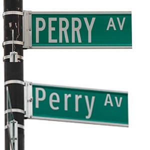
When Barack Obama promised America “change,” no one thought change might include the Federal Highway Administration mandating font changes on all New York Street signs to “improve readability.”
The street sign update is a shining example of how an inept federal government utilizes hard-earned tax dollars. Changing perfectly acceptable street signs from upper to mixed-case takes precedence over projects like repairing roads and attending to decrepit subway stations whose signage, thankfully, is already upper-lower case.
New York State will be forced to subsidize sign-swapping instead of using the money to address pressing needs such as “42% of New York’s bridges [that] are structurally deficient or functionally obsolete…and…46% of New York’s major roads [that] are in poor or mediocre condition.”
The same federal government that squanders tax money to sponsor “searching for the elusive Alaskan ice worm” believes that street signs take precedence over “391 high hazard dams in New York,” which have the potential to cause “loss of life and significant property damage.”
Federal-level copy editors require New York switch out 250,900 supposedly unreadable street signs at “$110 per sign,” which will cost New York State “$27.6 million.” The plan: Trade standard highway typeface “WALL STREET” lettering for the more federally desirable Clearview font, developed specifically for street signs.
City Transportation Commissioner Janette Sadik-Khan believes that, while costly, new signage is a way to share the “I love New York” spirit. Sadik-Khan said, “On the Internet, writing in all caps means you are shouting…the new diminutive signs…feature new reflective sheeting,” which could “reflect a kinder, gentler New York.”
Capitalized street signs have been used for more than a century in New York, which makes one wonder how the Empire State managed to become an overpopulated metropolis. Why the change? Because federal documents show that “[i]t is harder to read all-caps signs, and those extra milliseconds spent staring away from the road have been shown to increase the likelihood of accidents, particularly among older drivers.”
So they’re saying that the urban phenomenon of car crashes, checkered cabs driving through storefrontwindows, and lifeless pedestrians is because visually-challenged drivers, trying to find “EAST 33rd and PARK AVENUE” are forced to squint to make sense of capital letters? Maybe the copy editors at the Federal Highway Administration could explain how changing from caps to upper-lower case prevents drivers from millisecond-street sign-staring when directional signage requires drivers to read either way?
In support of the new guidelines, Transportation Secretary Ray LaHood said “Safety is this department’s top priority. These new and updated standards will help make our nation’s roads and bridges safer for drivers, construction workers and pedestrians alike.”
Highway administration spokesman Doug Hecox said, “The mixed upper- and lowercase rule was adopted in 2003,” but “municipalities were given a 15-year phase in period to comply.” The Highway Administration also acknowledged that New York and other states “opposed the change…noting that while the mixed-case words might be easier to read, the amount of improvement in legibility did not justify the cost.” Hecox’s words may be the first sensible utterance to ever issue forth from bureaucratic lips.
Nevertheless, and in light of a pressing street sign crisis, thank God New York agreed to save lives by making the upper-lower case change. In the meantime, until switch completion in 2018 and in order to accommodate 8 more years of fatal font fatalities, all New Yorkers can hope for is that at least the directional signs pointing toward metropolitan area cemeteries remain legible.